
Work
About
Contact
Developing a brand for a local brewery.

As a designer, artist, and supporter of local brewing, having the opportunity to develop a brand for a beer company, including the logo and packaging, seemed like a fun project to me. I’ve always been struck by the diversity of illustration in beer can design, and thus wanted to try my hand at the development of my own beer brand that took into account Toronto’s rich history.
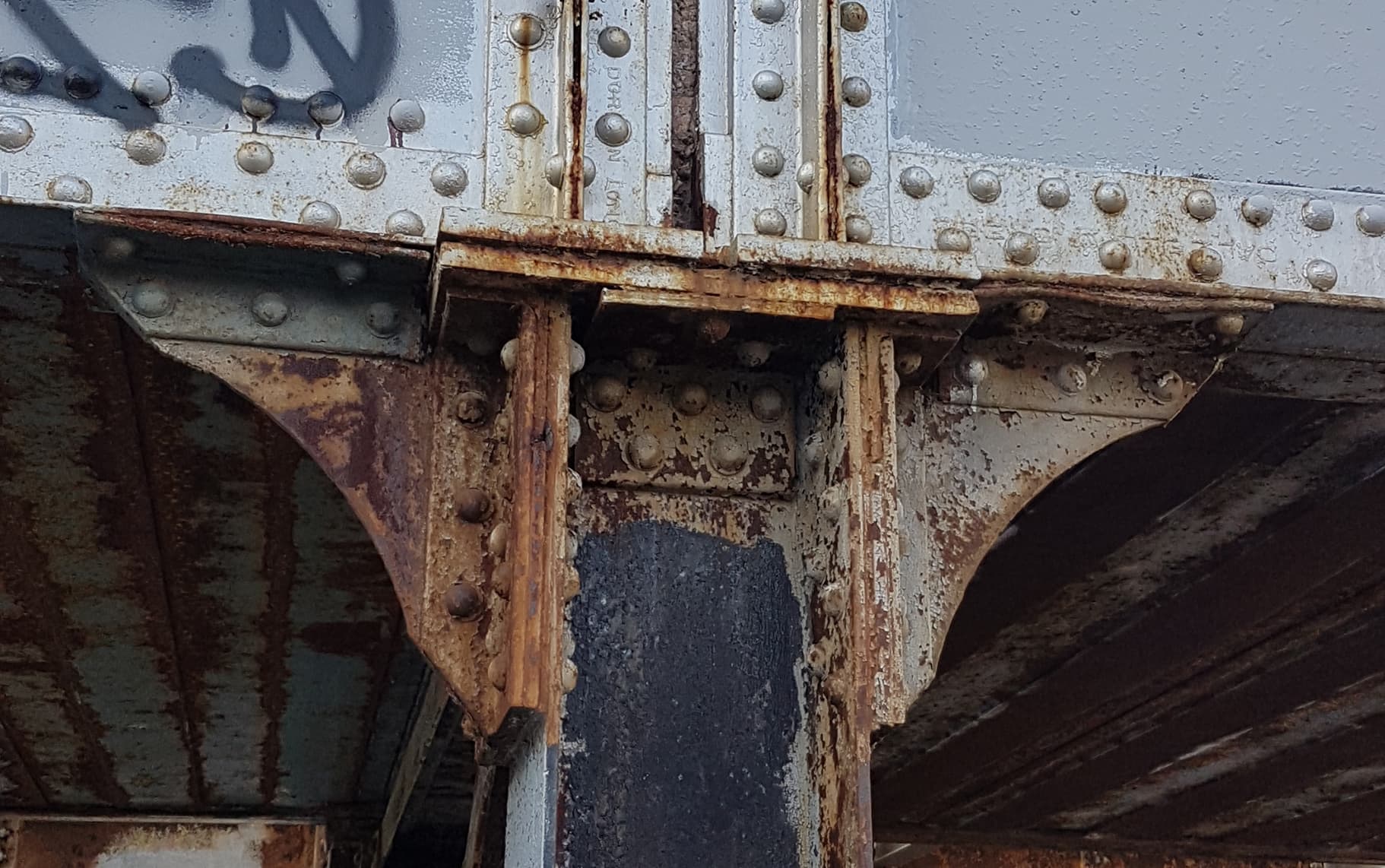
This project began as part of my final brand design assignment while attending George Brown College’s graphic design program. I was inspired to create the Bridgeman Brewing brand by the area I was living in at the time, which was intersected by a CPR (Canadian Pacific Rail) corridor with century-old bridge construction dating from 1913. The steel rivets, cross-beams, and industrial look of the bridge caused me to reflect on Toronto’s history as a hub for the transportation of goods by train and ship. I then decided I wanted to capture some of these turn of the century design motifs in my branding project.
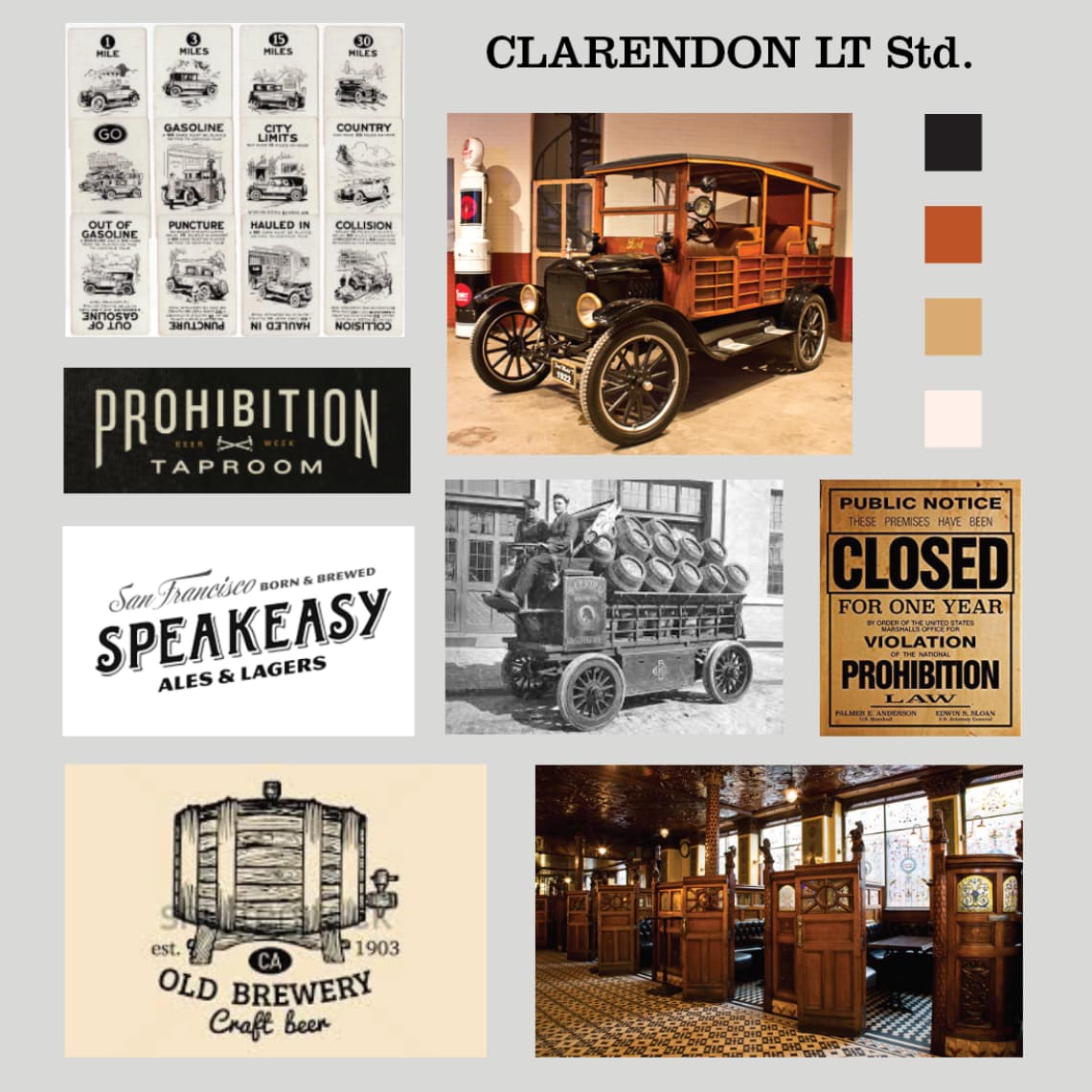
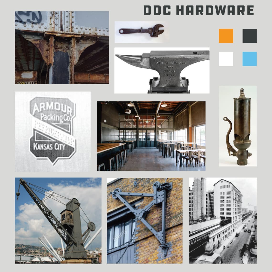
2 mood boards were created with the intention to define the creative direction I wanted the brand to go in. The first mood board was inspired by turn of the century branding, prohibition, wood paneling and serifed fonts. The second mood board was much more industrial, with a focus on steel, shipping, and sans-serifed fonts. Both of these mood boards would also help later define the can design for beer.
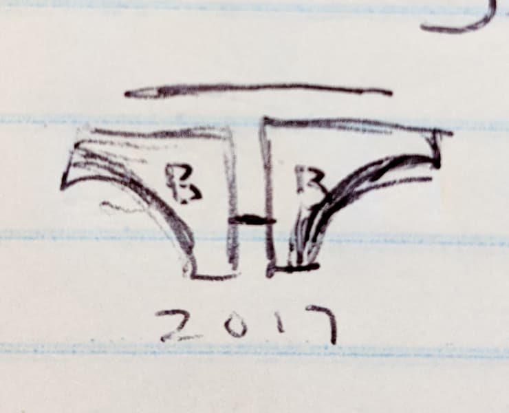
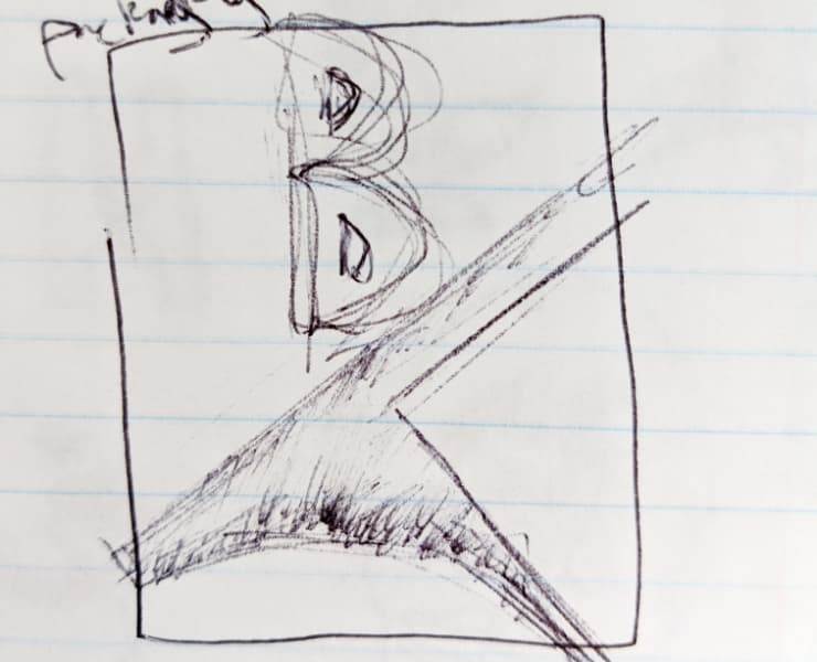
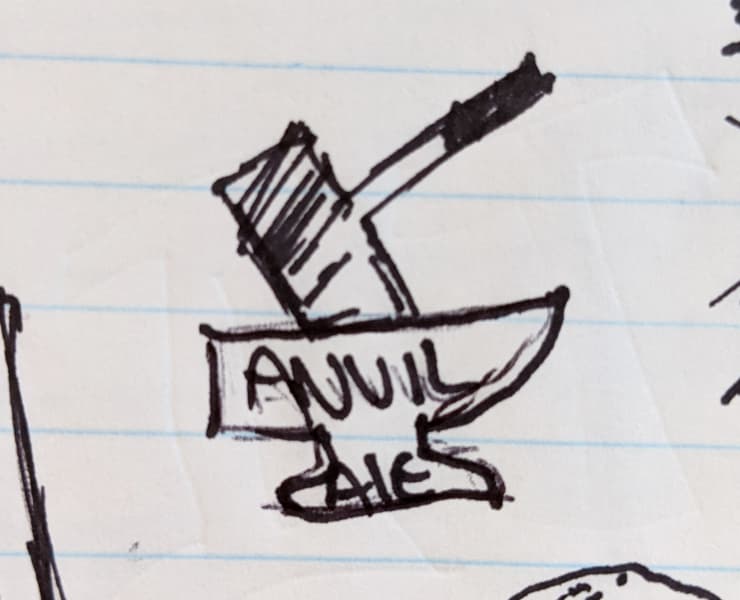
Some early-on notebook sketches of potential logo concepts, inspired by the bridge near my house.
After defining what my subject matter was going to be, I played around in Illustrator with various fonts and motifs, until I settled on 4 different directions for the brand.
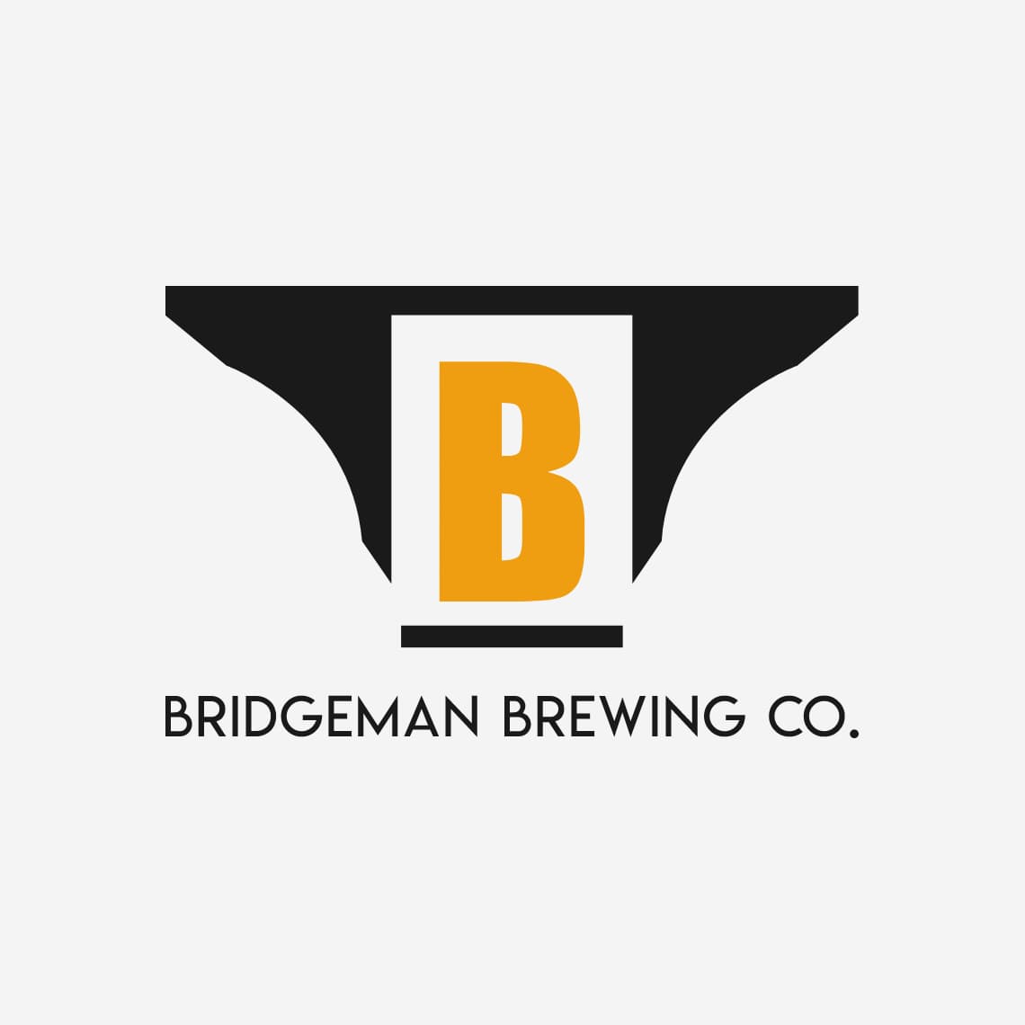
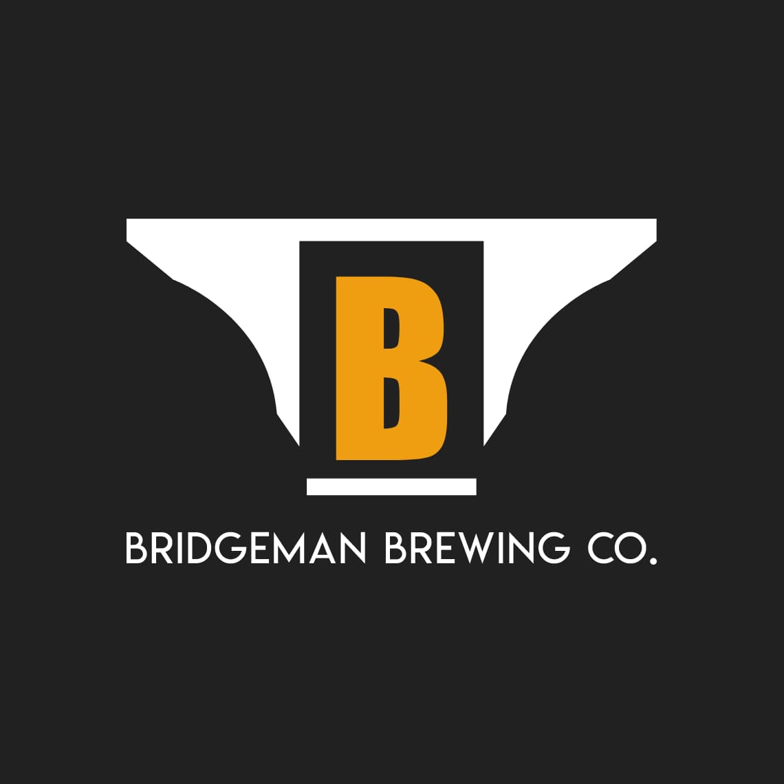
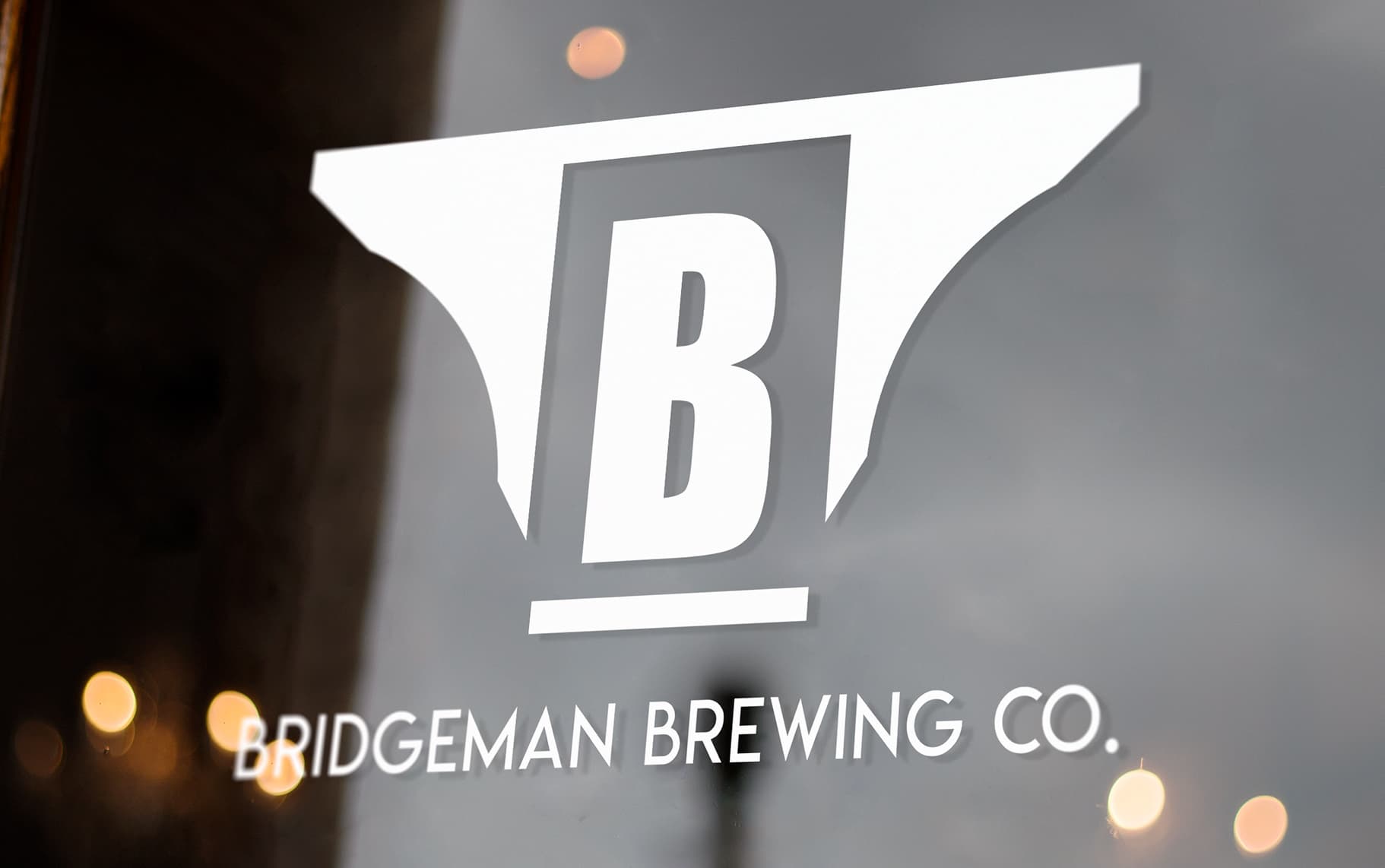
The final lockup ended up being a combination of initial concepts 3 and 4. It was chosen for its clean design, scalability, pop of colour, and reference to the bridge. Lemon/Milk font was chosen for the wordmark as it was clean, yet had some styled elements.
After the brand logo was finalized, the next step was to come up with two separate beer can designs for Bridgeman that could be used to package their 2 flagship beers, a pilsner and brown ale.
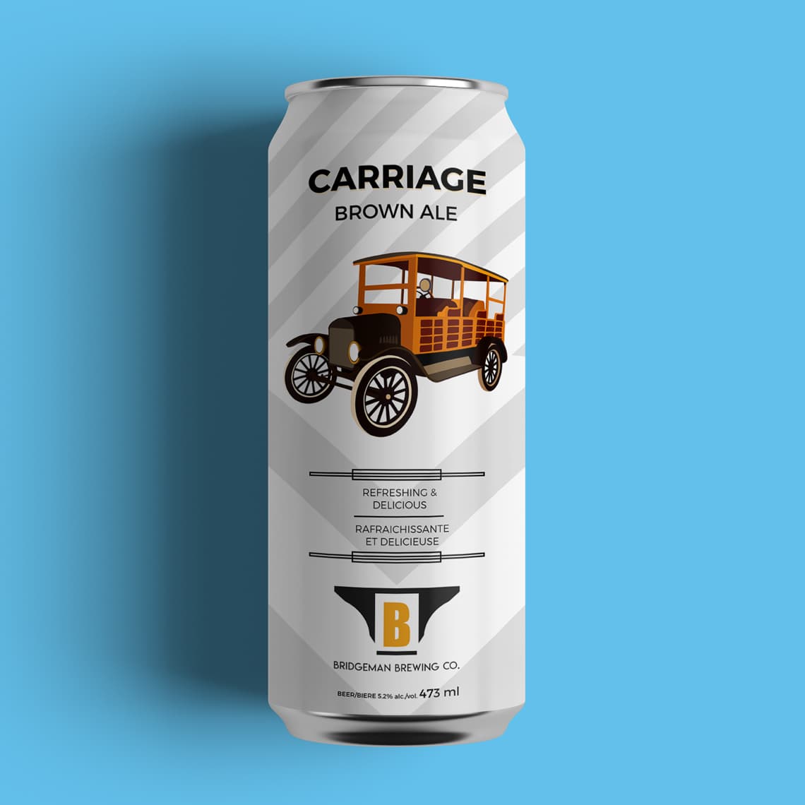
For the can design of Carriage Brown Ale, I utilized an illustration of a 1922 Ford Model T Woody, a vehicle which is on display in the Casa Loma automotive museum in Toronto. This would have been a vehicle prominent in the prohibition era, and may have even been used for smuggling. Additional design elements like tire tracks and a clean Montserrat font were used to enhance the aesthetic.
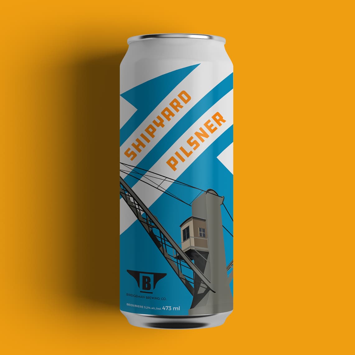
The shipping industry of the Great Lakes during the early 1900s inspired the can design for Shipyard Pilsner. The illustration on the can is based on a hydraulic crane built in 1888 by Tannet & Walker company for the port of Genoa. Although this specific model was not in Toronto turn of the century, many cranes like it loaded goods on and off of ships down at Toronto’s ports. The can design features additional design elements like shipping lanes and an industrial font, DDC Hardware.
All pages were optimized for mobile, as over 50% of triangle.com's traffic was mobile-based.
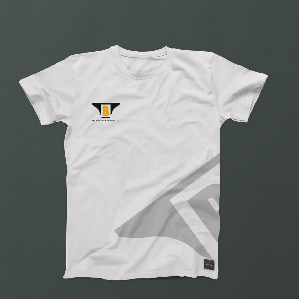
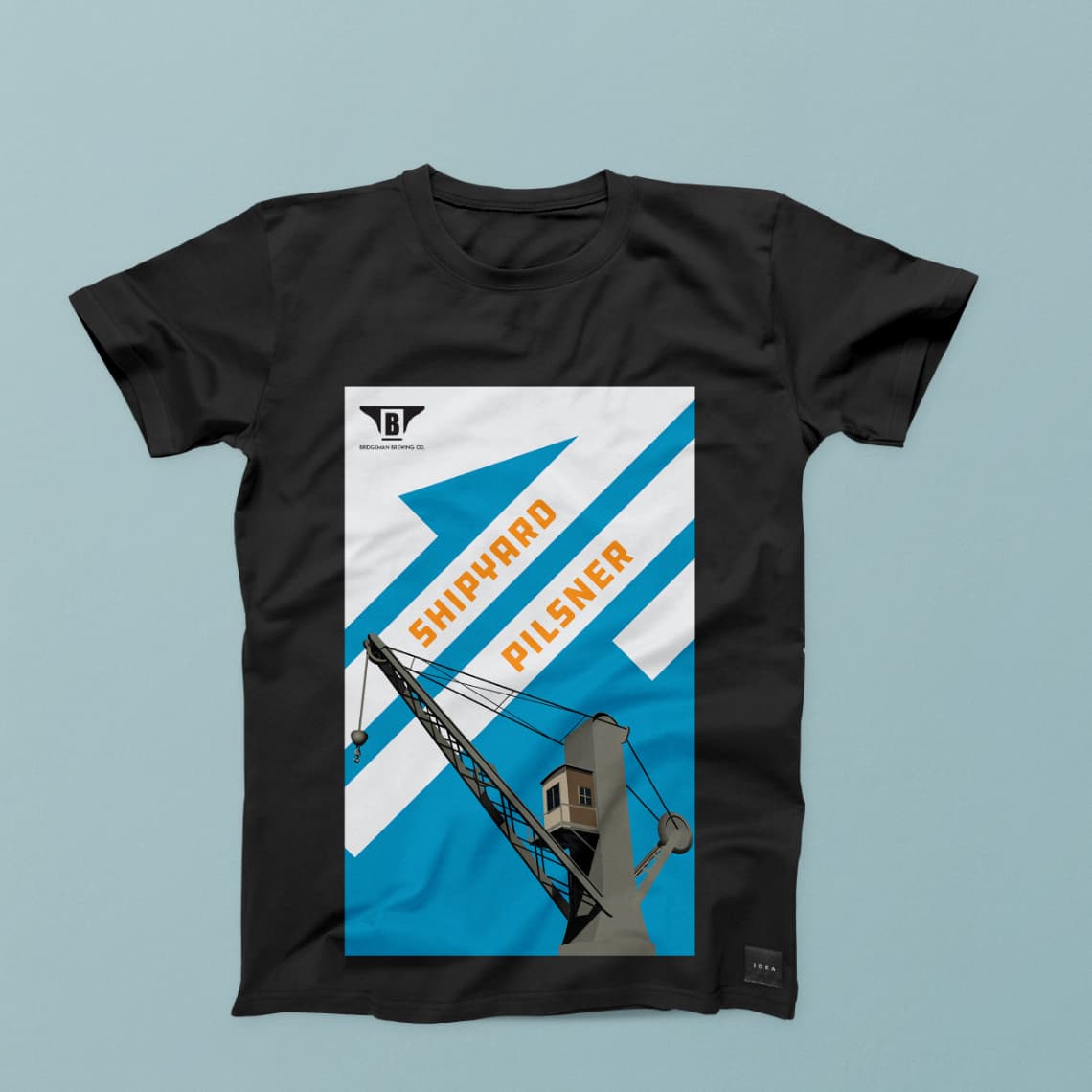
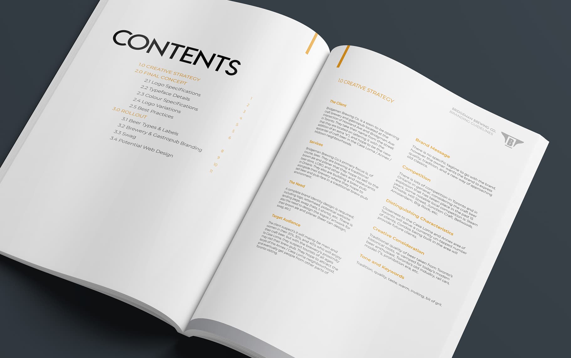
A final brand style guide was created that encompassed proper logo treatment, as well as usage across multiple products.
This was a really fun project from start to finish. Having the opportunity to research industry in Toronto from the early 1900’s to the late 1920’s provided a historical background that helped ground this brand in reality, time, and place. Since Bridgeman Brewing is not a real brand, it was important for me that the importance be placed on history and story telling in the design so that the brand became believable. This proved effective, since I have received emails from people enquiring as to where they can find the brewery itself.
If I could have done some things differently, it would have been giving more focus to how this brand would appear digitally, but since this was primarily a brand and package design project, I’m inclined to leave that for another project.
© 2023 Tom Seymour, all rights reserved.

